Hopeless, Maine (vol. 1) by Tom and Nimue Brown ( Amazon.com )
Sloth Comics, 2016
ISBN-13: 9781908830128
Available: Paperback
Hopeless, Maine tells the story of Salamandra, an orphan girl who is taken in to a home for orphans; strangely not many adults are around. Sal discovers the strange and sometimes nightmarish creatures on the island are things best to be avoided. She befriends another young girl, but no one else seems to be able to see her. Their friendship takes a dark turn when the young girl discovers Sal’s magical abilities. The girl also becomes jealous of other friendships that Sal tries to form. When Sal discovers the girl’s true nature, she must protect herself and a new friend, Owen, that she has made at the orphanage. They both want desperately to make their own ways and break the hold the island has over them. Sal finds out she may have family on the island and will do anything to know more about her kin and herself.
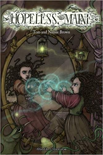
I like the dynamic between Sal and Owen, the headmaster’s son. Sal is outspoken, while Owen is more reserved and thoughtful, acting as almost a way to calm Sal when she gets her hackles up about something. She’s quite strong-willed, and Owen’s relaxed demeanor is a lovely complement to Sal’s headstrong ways. The artwork is rich and well executed. The character and creature designs are unique, and the colour palette that the artist chose is oppressive, but that really brings out the glow of the candlelight and magic that is central to the story. It’s quite beautiful.
Hopeless, Maine contains a piece of poetry, two complete stories, a short story, and extra artwork. While the story and the artwork are wonderful, there are two major issues with the book. The size of the book is smaller than the typical loose comic or graphic novel size. A larger format would have helped both problems. First, it would be easier to read, especially the poetry at the beginning and short piece at the end. Frankly, I had to skip over them because the white text against the black background was far too small to be read comfortably. It’s definitely smaller than a ten-point font. Going with a larger format would also improve the text in the graphic novel portions of the book. Second, a larger format might have actually helped me appreciate the artwork more considering there are some subtleties to it that I had to squint in order to really pick up. Recommended if you have good eyesight.
Reviewed by Lizzy Walker


Follow Us!